> ## Documentation Index
> Fetch the complete documentation index at: https://docs.converlens.com/llms.txt
> Use this file to discover all available pages before exploring further.
# Message Stage
# About Message Stage
The **Message Stage** is where you create, format, and finalise your messages before sending or publishing them. This is where you write your content, add sections, and structure the layout of your message.
The Composer allows you to:
* Add and arrange content blocks (text, images, buttons, dividers, etc.)
 * Customise formatting, colours, and spacing
* Preview messages in different layouts (desktop, mobile, email, and web)
# Editing your Message
###
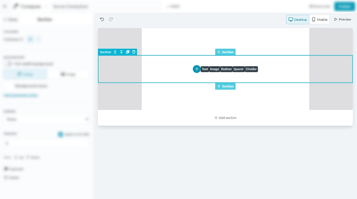
## Adding sections
Your message is built using sections, which help organise content.
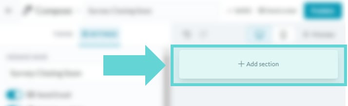
* Click **Add section** to insert a new content section.
* Each section can contain text, images, buttons, dividers, or spacers.
## Duplicating sections
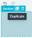
To reuse a section, mouse over any section in your message to display the duplicate button. Click duplicate to create a copy of the highlighted section
## Moving sections
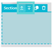
If your message has multiple sections, you can rearrange them:
* **Move Up:** Moves the section one position higher.
* **Move Down:** Moves the section one position lower.
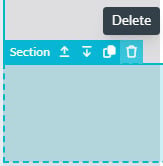
## Deleting sections
To remove a section mouse over any section in your message to display the delete button.
# Adding Content
#
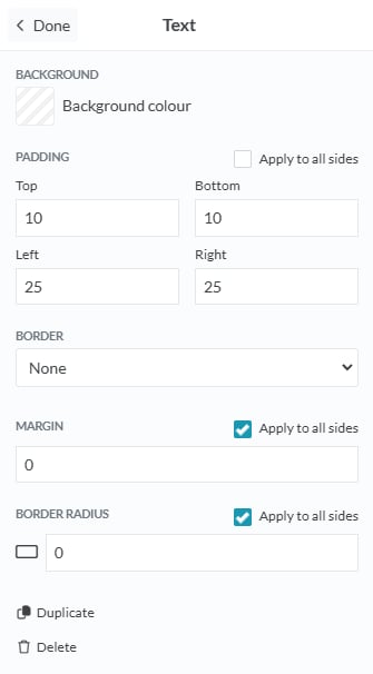
## Text
Click on the text block to display the Text options in the settings panel.
### Text Options
* **Background colour:** Click the colour box to open the colour picker, where you can slide to choose a colour, or manually enter a hex code to set the background colour for the text area.
* **Padding:** Adjust the padding between the edge of the text box and the text. Click apply to all sides to apply the same padding distance on all sides, or manually adjust top, bottom, left and right by entering a number in the text box.
* **Border:** Select and apply a border to the text area
* **Margin:** Adjust the margin between the text area and bounds of the message area. Click apply to all sides to apply the same padding distance on all sides, or manually adjust top, bottom, left and right by entering a number in the text box.
* **Border Radius:** Adjust how rounded the corners of the text box appear by entering a number in the text box.
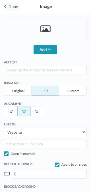
## Images
Click on the +Add Image button to display the Image options in the settings panel.
### Image Options
To add an image, click the **Add** button and choose from the following options:
* **Paste a link to an image:** Enter the URL of an image hosted online
* **Upload image:** Select an image file directly from your device.
* **Select from Unsplash:** Browse and choose a high-quality image from Unsplash to include in your message.
* **Alt Text:** Enter a description of the image in the text box to improve accessibility and provide context for users who cannot see the image.
* **Image Size:**
* **Original:** Select this option to display the image at its original size.
* **Fill:** Choose this option to scale the image to fill the available space while maintaining its aspect ratio.
* **Custom:** Manually adjust the width and height of the image by entering specific dimensions.
* **Scale to full width on mobile:** Tick this box to ensure the image automatically stretches to the full width of the screen on mobile devices.
* **Alignment:** Use the alignment options to position the image within its container. Choose left, centre, or right alignment.
* **Link to:** Add a hyperlink to the image by selecting one of the following options:
* **Website:** Enter a URL to direct users to a specific web page when they click the image.
* **Email:** Enter an email address to open the user's email client with a pre-filled recipient.
* **Phone:** Enter a phone number to enable users to call directly when they click the image (on supported devices).
* **Rounded Corners:** Adjust the roundness of the image corners by entering a value in the text box. Higher values create more rounded corners.
* **Background colour:** Click the colour box to open the colour picker. Use the slider to select a colour or enter a hex code to set the background colour behind the image.
* **Padding:** Adjust the spacing between the image and its container. Click **Apply to all sides** to use the same padding on all sides, or adjust each side individually by entering values for top, bottom, left, and right.
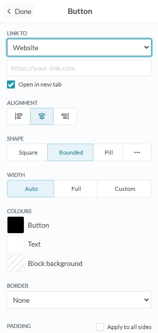
## Buttons
Click on the +Add Button to insert an interactive button and display the Button options in the settings panel.
### Button options
* **Link to:** Add a hyperlink to the button by selecting one of the following options:
* **Website:** Enter a URL to direct users to a specific web page when they click the button.
* **Email:** Enter an email address to open the user's email client with a pre-filled recipient.
* **Phone:** Enter a phone number to enable users to call directly when they click the button (on supported devices).
* **Alignment:** Use the alignment options to position the button within its container. Choose left, centre, or right alignment.
* **Shape:** Adjust the button's shape to suit your design:
* **Square:** Creates a rectangular button with sharp corners.
* **Rounded:** Adds slight roundness to the corners for a softer look.
* **Pill:** Creates a fully rounded button for a sleek, modern appearance.
* **Set px:** Enter a custom pixel value to define the specific roundness of the button’s corners.
* **Width:** Determine how the button fits within its container:
* **Auto:** Automatically adjusts the button width based on the text length.
* **Full:** Expands the button to fill the entire width of the container.
* **Custom:** Manually set the button width by entering a specific dimension.
* **Colours:** Click the colour box to open the colour picker. Use the slider to select a colour or enter a hex code to customise the following:
* **Button:** The background colour of the button itself.
* **Text:** The colour of the button’s text.
* **Block background:** The background colour behind the button (the surrounding container).
* **Border:** Select and apply a border to the button
* **Padding:** Adjust the spacing between the image and its container. Click **Apply to all sides** to use the same padding on all sides, or adjust each side individually by entering values for top, bottom, left, and right.
* **Margin:** Adjust the margin between the button area and bounds of the message area. Click apply to all sides to apply the same margin distance on all sides, or manually adjust top, bottom, left and right by entering a number in the text box.
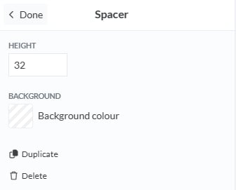
### Spacer
Click on +Add Spacer to add extra space between sections and display the Spacer options in the settings panel.
* **Height:** Set the height of the Spacer by entering a number in the text box
* **Background Colour:** Click the colour box to open the colour picker. Use the slider to select a colour or enter a hex code to select the colour for the Spacer area.
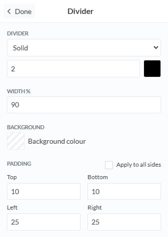
### Divider
Click on +Add Divider to insert a horizontal line separator and display the Divider options in the settings panel.
### **Divider Options:**
* **Divider Style:** Choose the style of the divider:
* **Solid:** A continuous, unbroken line.
* **Dashed:** A line made up of short dashes.
* **Dotted:** A line made up of dots.
* **Double:** Two parallel solid lines.
* **Thickness:** Select or enter a numerical value to adjust the thickness of the divider line. Higher values create a thicker line.
* **Colour:** Click the colour box to open the colour picker. Use the slider to choose a colour or enter a hex code to set the divider line colour.
* **Width (%):** Set the width of the divider as a percentage of the container’s width. A smaller percentage creates a shorter line, while 100% spans the entire container width.
* **Background Colour:** Click the colour box to choose a background colour for the area surrounding the divider.
* **Padding:** Adjust the spacing above and below the divider. Click **Apply to all sides** to use the same padding on all sides, or customise top, bottom, left, and right padding individually by entering values.
# Message Stage Controls
The **Message Stage** includes tools to undo actions, preview your message, and switch between desktop and mobile views. These are located at the top of the Message Stage.
## Undo / Redo
* **Undo:** Click the back arrow button to undo your most recent action. It helps you quickly revert changes made to your message.
* **Redo:** Click the forward arrow button to redo an action that was previously undone. It allows you to restore changes you’ve reverted.
## **Desktop / Mobile View**
* **Desktop**: Click this button to view your message as it would appear in a desktop layout, giving you a preview of how it will look on computer screen.
* **Mobile:** Click this button to view your message as it would appear on a mobile device, allowing you to preview how it will display on a mobile screen.
## Preview Message
Click **Preview** to open an overlay showing how your message will appear in an inbox. It includes a preview of the message inbox with details such as the **From**, **Subject**, and **Date Sent**, plus a preview of how the message will display.
### **Preview Options:**
* Customise formatting, colours, and spacing
* Preview messages in different layouts (desktop, mobile, email, and web)
# Editing your Message
###
## Adding sections
Your message is built using sections, which help organise content.
* Click **Add section** to insert a new content section.
* Each section can contain text, images, buttons, dividers, or spacers.
## Duplicating sections
To reuse a section, mouse over any section in your message to display the duplicate button. Click duplicate to create a copy of the highlighted section
## Moving sections
If your message has multiple sections, you can rearrange them:
* **Move Up:** Moves the section one position higher.
* **Move Down:** Moves the section one position lower.
## Deleting sections
To remove a section mouse over any section in your message to display the delete button.
# Adding Content
#
## Text
Click on the text block to display the Text options in the settings panel.
### Text Options
* **Background colour:** Click the colour box to open the colour picker, where you can slide to choose a colour, or manually enter a hex code to set the background colour for the text area.
* **Padding:** Adjust the padding between the edge of the text box and the text. Click apply to all sides to apply the same padding distance on all sides, or manually adjust top, bottom, left and right by entering a number in the text box.
* **Border:** Select and apply a border to the text area
* **Margin:** Adjust the margin between the text area and bounds of the message area. Click apply to all sides to apply the same padding distance on all sides, or manually adjust top, bottom, left and right by entering a number in the text box.
* **Border Radius:** Adjust how rounded the corners of the text box appear by entering a number in the text box.
## Images
Click on the +Add Image button to display the Image options in the settings panel.
### Image Options
To add an image, click the **Add** button and choose from the following options:
* **Paste a link to an image:** Enter the URL of an image hosted online
* **Upload image:** Select an image file directly from your device.
* **Select from Unsplash:** Browse and choose a high-quality image from Unsplash to include in your message.
* **Alt Text:** Enter a description of the image in the text box to improve accessibility and provide context for users who cannot see the image.
* **Image Size:**
* **Original:** Select this option to display the image at its original size.
* **Fill:** Choose this option to scale the image to fill the available space while maintaining its aspect ratio.
* **Custom:** Manually adjust the width and height of the image by entering specific dimensions.
* **Scale to full width on mobile:** Tick this box to ensure the image automatically stretches to the full width of the screen on mobile devices.
* **Alignment:** Use the alignment options to position the image within its container. Choose left, centre, or right alignment.
* **Link to:** Add a hyperlink to the image by selecting one of the following options:
* **Website:** Enter a URL to direct users to a specific web page when they click the image.
* **Email:** Enter an email address to open the user's email client with a pre-filled recipient.
* **Phone:** Enter a phone number to enable users to call directly when they click the image (on supported devices).
* **Rounded Corners:** Adjust the roundness of the image corners by entering a value in the text box. Higher values create more rounded corners.
* **Background colour:** Click the colour box to open the colour picker. Use the slider to select a colour or enter a hex code to set the background colour behind the image.
* **Padding:** Adjust the spacing between the image and its container. Click **Apply to all sides** to use the same padding on all sides, or adjust each side individually by entering values for top, bottom, left, and right.
## Buttons
Click on the +Add Button to insert an interactive button and display the Button options in the settings panel.
### Button options
* **Link to:** Add a hyperlink to the button by selecting one of the following options:
* **Website:** Enter a URL to direct users to a specific web page when they click the button.
* **Email:** Enter an email address to open the user's email client with a pre-filled recipient.
* **Phone:** Enter a phone number to enable users to call directly when they click the button (on supported devices).
* **Alignment:** Use the alignment options to position the button within its container. Choose left, centre, or right alignment.
* **Shape:** Adjust the button's shape to suit your design:
* **Square:** Creates a rectangular button with sharp corners.
* **Rounded:** Adds slight roundness to the corners for a softer look.
* **Pill:** Creates a fully rounded button for a sleek, modern appearance.
* **Set px:** Enter a custom pixel value to define the specific roundness of the button’s corners.
* **Width:** Determine how the button fits within its container:
* **Auto:** Automatically adjusts the button width based on the text length.
* **Full:** Expands the button to fill the entire width of the container.
* **Custom:** Manually set the button width by entering a specific dimension.
* **Colours:** Click the colour box to open the colour picker. Use the slider to select a colour or enter a hex code to customise the following:
* **Button:** The background colour of the button itself.
* **Text:** The colour of the button’s text.
* **Block background:** The background colour behind the button (the surrounding container).
* **Border:** Select and apply a border to the button
* **Padding:** Adjust the spacing between the image and its container. Click **Apply to all sides** to use the same padding on all sides, or adjust each side individually by entering values for top, bottom, left, and right.
* **Margin:** Adjust the margin between the button area and bounds of the message area. Click apply to all sides to apply the same margin distance on all sides, or manually adjust top, bottom, left and right by entering a number in the text box.
### Spacer
Click on +Add Spacer to add extra space between sections and display the Spacer options in the settings panel.
* **Height:** Set the height of the Spacer by entering a number in the text box
* **Background Colour:** Click the colour box to open the colour picker. Use the slider to select a colour or enter a hex code to select the colour for the Spacer area.
### Divider
Click on +Add Divider to insert a horizontal line separator and display the Divider options in the settings panel.
### **Divider Options:**
* **Divider Style:** Choose the style of the divider:
* **Solid:** A continuous, unbroken line.
* **Dashed:** A line made up of short dashes.
* **Dotted:** A line made up of dots.
* **Double:** Two parallel solid lines.
* **Thickness:** Select or enter a numerical value to adjust the thickness of the divider line. Higher values create a thicker line.
* **Colour:** Click the colour box to open the colour picker. Use the slider to choose a colour or enter a hex code to set the divider line colour.
* **Width (%):** Set the width of the divider as a percentage of the container’s width. A smaller percentage creates a shorter line, while 100% spans the entire container width.
* **Background Colour:** Click the colour box to choose a background colour for the area surrounding the divider.
* **Padding:** Adjust the spacing above and below the divider. Click **Apply to all sides** to use the same padding on all sides, or customise top, bottom, left, and right padding individually by entering values.
# Message Stage Controls
The **Message Stage** includes tools to undo actions, preview your message, and switch between desktop and mobile views. These are located at the top of the Message Stage.
## Undo / Redo
* **Undo:** Click the back arrow button to undo your most recent action. It helps you quickly revert changes made to your message.
* **Redo:** Click the forward arrow button to redo an action that was previously undone. It allows you to restore changes you’ve reverted.
## **Desktop / Mobile View**
* **Desktop**: Click this button to view your message as it would appear in a desktop layout, giving you a preview of how it will look on computer screen.
* **Mobile:** Click this button to view your message as it would appear on a mobile device, allowing you to preview how it will display on a mobile screen.
## Preview Message
Click **Preview** to open an overlay showing how your message will appear in an inbox. It includes a preview of the message inbox with details such as the **From**, **Subject**, and **Date Sent**, plus a preview of how the message will display.
### **Preview Options:**

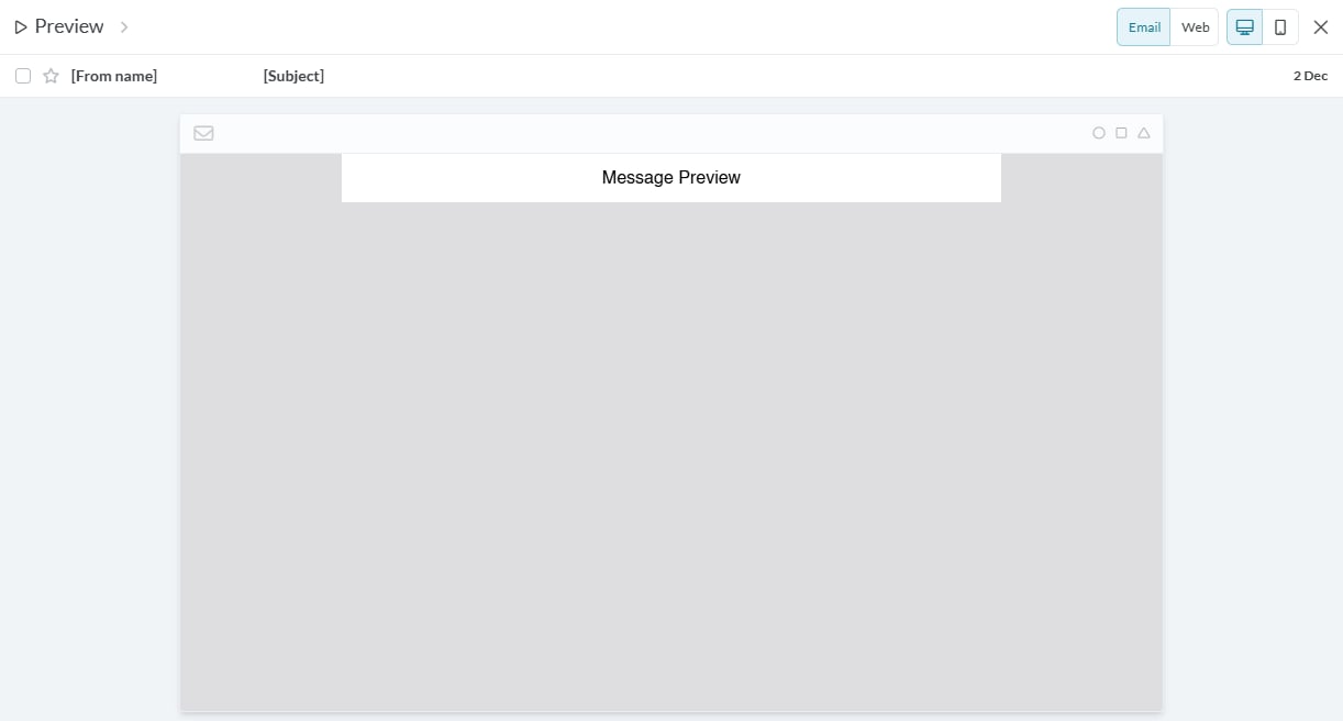 * **Email vs. Web View:** Toggle between email and web previews.
* **Desktop vs. Mobile View:** See how the message displays on different devices (desktop or mobile)
* **Close Preview:** Click X in the top-right corner.
* **Email vs. Web View:** Toggle between email and web previews.
* **Desktop vs. Mobile View:** See how the message displays on different devices (desktop or mobile)
* **Close Preview:** Click X in the top-right corner.